Pablo Picasso once said: “Colors, like features, follow the changes of the emotions.”
Whether we feel excited or sad, optimistic or mournful, flamboyant or in distress, colors have the ability to portray our emotions.
Such is the case with delivering presentations. While your delivery should be on point, having the right color scheme for your presentation is equally important.
That being said, what are the best color schemes that you should use for your presentations?
Well, the answer depends on how you want your audience to feel.
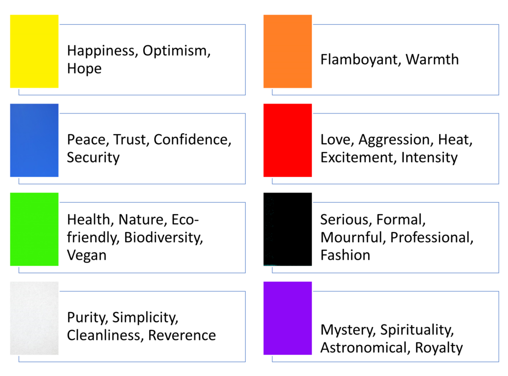
Different feelings come with different colors. To have a better idea of how these work, have a look at this table:

Now that you’ve got a fair idea of how different colors represent different emotions, let’s get down straight to some of the best color options you can use for your PowerPoint presentations.
It is however to be noted that all these suggestions are based on our analysis of different industries and niches and may vary for your niche, so before you use any of our suggested templates, have a look at your company’s color palette requirement.
Hues of black:
First up on our list is our personal favorite and probably one of the most trendy color schemes that is being used in presentations for quite some time now “The Hues of Black”.
As mentioned above, black reflects a tone of professionalism and seriousness which makes this color scheme a perfect fit for business, fashion, and formal presentation.
If lighting is no issue, then you should definitely go with this color scheme as it not only adds a touch of credibility but also gives a sense of maturity and confidence.
Vibrant Coral:
This color scheme might come as surprise to you, but the truth is that coral is an excellent, vivid color that has the ability to capture the audience’s attention instantly due to its unlikely yet vibrant nature.
Consider using this color scheme if your brand has coral in its color palette or if you are looking to use a new and trendy color in your presentation.
Monochromatic blue:
Blues are never out of fashion. Having a color scheme in your presentations with different shades of the same blue color can you give your presentation a nice, confident, and natural look.
A blend of the different shades of blue will make your presentation even more appealing and this color scheme will ensure all eyes stay on the screen.
Teal and White:
While we’re talking about the best colors for PowerPoint presentations, Teal is a color that cannot be overlooked.
This color is a blend of blue and green which makes enriches it with the properties of both these colors. As a result, teal comes out as the perfect combo of blue’s confidence along with green’s healing abilities.
Also adding white spaces in between can give a professional and confident look to your presentation.
Red and Black:
This combo has a special place in the world of fashion, design, and style.
If you’re looking to make a bold statement or come out strong then this color scheme would be a great choice, however, it can get a lot trickier on the projector display as the bright red color compromises the visibility of the accent.
Still, if the presentation you’re delivering is on a digital display, then you can go with this color combo as the impact it creates cannot be denied.
Organic Greens:
Green is the color of nature and when used in presentations can have a soft and natural feel.
This color scheme is ideal for presentations related to health, nature, environment, vegan, and wildlife.
Organic greens when paired with black and white images and an accent of black or darker shade can have a smooth and soft impact on the overall look of your presentation.
Navy and Orange/Lime:
Navy when combined with a brighter color like orange or lime becomes such a strong combo for presentation designs that is bound to succeed.
Navy and orange or navy and lime are two excellent color schemes for presentations due to the contrasting nature of these colors and the vivid appearance they have.
Pink and Purple:
This is a very vibrant and feminine color scheme that can be used for presentations featuring beauty brands and retail stores.
The colors used in this combo are very bold and luxurious which makes it a perfect choice for presentations focusing on expanding the customer reach of their brands.
When used properly this color combination can become a game-changer.
Blue-Green Gradients:
Another trending feature in colors is the use of gradients. Using a blue to green gradient can be an excellent way to show a soft and harmonious color scheme.
It also gives a soft and sleek design to your presentations while also maintaining a level of professionalism.
Dark Gray and Yellow:
Using a darker color scheme can give a serious tone to your presentations which is good when you’re delivering in a corporate environment and combining it with a yellow highlight creates high contrast and can be used to direct the reader’s gaze to the important elements of the page and also make the key messages stand out.
The highly contrasting nature of these colors is what makes them an excellent choice for business presentations as you get both seriousness and style on the same page.
Some honorable mentions:
Now while these color combos haven’t made it to our list, this by no means makes them any less important than those mentioned above. You can always resort to these colors whenever you want a change of look.
- Orange and white
- Dark Gray and blue
- Mint green
- Dark purple and yellow
- Beige and dark blue


