Gone are the days of static presentations filled with text-heavy slides and monotonous narration. PowerPoint presentations are now considered dynamic instruments in the field of modern communication, with the ability to influence perceptions and improve information retention. As the proverb goes, “A picture is worth a thousand words,” and in the digital age, a well-crafted presentation can transcend linguistic barriers, conveying complex ideas with visual finesse.
The year 2024 promises to be an exciting year for presentation design, with innovative trends emerging that prioritize clarity, engagement, and interactivity. Whether you’re a seasoned presenter or just starting, staying informed about these trends can help you craft presentations that resonate with your audience and leave a lasting impression.
The renowned words of Albert Einstein resonate, reminding us that “If you can’t explain it simply, you don’t understand it well enough.” This wisdom underscores the importance of not just creating presentations but crafting them thoughtfully to ensure clarity and comprehension. Today, we pursue the art and science of PowerPoint design, exploring how it transcends the mere arrangement of slides to become an immersive experience that captivates and informs.
This blog post will serve as your guide to the top PowerPoint presentation design trends for 2024. We’ll look into various aspects, including:
Key Takeaways from Top PowerPoint Presentation Design Trends
- PowerPoint Design Trends for 2024 are all about creativity and communicating your message effectively.
- Use vibrant colors to grab your audience’s attention and create visually stunning presentations.
- Create custom illustrations and icons to add a unique touch to your presentations.
- Explore the shift towards minimalism, the power of large typography, and the strategic use of color and imagery.
- Discover how incorporating video, motion graphics, and 3D elements can elevate your presentations.
- Learn how to transform complex data into easily digestible and visually appealing infographics and charts.
- Engage your audience through polls, quizzes, Q&A sessions, and brainstorming tools.
By incorporating these trends, you can create presentations that are not only informative but also visually stunning, interactive, and ultimately, unforgettable. So, join us on this journey to unlock the full potential of your presentations and discover how to design experiences that captivate, inform, Inspire, and transform.
1- Minimalist Design Takes Center Stage
With the rise of cluttered and overwhelming presentations, minimalist design is a breath of fresh air. This clean and simple approach focuses on the core message of your presentation, allowing your audience to absorb the information without distraction.
Minimalist design is all about removing excess and focusing on what’s essential. By using whitespace, a limited color palette, and simple typography, you can create visually appealing slides that convey your message with clarity.
When using a minimalist design approach, it’s important to remember that less is more. Avoid cluttering your slides with unnecessary elements and stick to the essentials. Use imagery sparingly, and make sure it enhances, rather than distracts from, your message.
Another aspect of minimalist design to consider is the use of negative space. By leaving whitespace around elements, you can create a sense of balance and harmony that draws the eye to key points of your presentation.
Therefore, embracing minimalist design is a powerful tool for creating clean and visually appealing presentations that keep your audience engaged. It allows you to focus on the core message of your presentation without distractions, resulting in a more impactful and memorable experience.
Why Minimalism Works
Clarity and Ease of Use
- Minimalist designs are inherently more user-friendly.
- Minimalist designs reduce cognitive load.
- Fewer elements on the screen make navigation easier.
Improved User Interaction
- Clean interfaces highlight important content.
- By minimizing distractions, users instantly focus on the key information.
- Minimalism has enduring appeal.
2- Multimedia Integration
Your audience is captivated by the visual appeal that multimedia elements bring. An effective audio or video clip can establish the mood, elicit feelings from the audience, and build connection. Think about incorporating components that support your argument and provoke an answer.
Adding multimedia elements to your PowerPoint presentations can improve engagement and make your message more memorable. With multimedia integration, you can include videos, audio clips, and interactive features that enhance your presentation’s impact and help your audience stay focused.
To seamlessly integrate multimedia, start by choosing high-quality elements that support your message and are appropriately sized. Optimize videos and audio clips for playback within PowerPoint and add interactive features such as clickable buttons or quizzes to keep your audience engaged. Consider the pacing and timing of multimedia elements and their placement on the slide to ensure they enhance rather than distract from your content.
Remember, when using multimedia, always test your presentation to ensure it works correctly on the device you intend to use. With careful planning and execution, multimedia integration can take your presentations to the next level and leave a lasting impression on your audience.
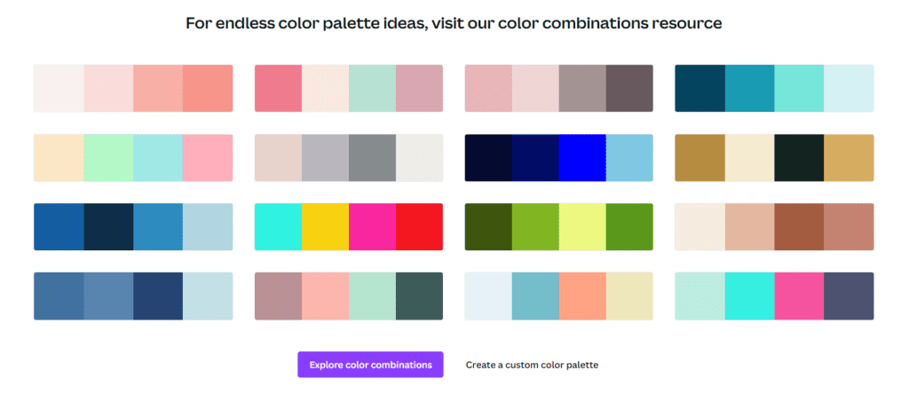
3- Vibrant and Eye-catching Color Schemes
One of the top trends in PowerPoint design for 2024 is the use of vibrant and eye-catching color schemes. Bright and bold colors can grab your audience’s attention and make your presentations visually stunning. However, it’s important to use these colors effectively and not overwhelm your audience.
Consider pairing bold colors with more neutral ones to balance your presentation. Using gradients and color overlays can also add depth and interest to your slides. Don’t be afraid to experiment with different color combinations to find what works best for your message.
Designing a color scheme is both an art and a science, requiring practice and design knowledge. PowerPoint offers pre-made color palettes, but PowerPoint Presentation services can assist in creating customized and harmonious color schemes. The color wheel is a fundamental tool, helping in choosing colors that work well together. Consider proximity for harmony or use opposite ends for high-contrast schemes.
Quick color theory tips include recognizing hues, tints, tones, and shades to understand the relationships between colors. Warm colors (e.g., red, orange, yellow) convey vibrancy, while cool colors (e.g., blue, green) create a calm and relaxing atmosphere. Tint (addition of white), tone (addition of gray), and shade (addition of black) provide different variations within a color scheme.
Six basic tips for working with colors in PowerPoint presentations include sticking to a single color palette, keeping it simple, using available tools, ensuring high contrast, following the 60-30-10 rule for color distribution, and aligning colors with your brand and audience. Most designers typically adhere to the following guidelines when incorporating three colors:
- Allocate 60% to the main color, often utilized as the background color.
- Dedicate 30% to the secondary color, commonly employed for shape fill.
- Reserve 10% for the accent color, typically applied in text, borders, and outlines.
Canva offers multiple easy approaches to generating a color scheme that can light up your Presentation Design. You can use this link to generate a beautiful color scheme for your presentation
A well-designed PowerPoint presentation can convey professionalism, creativity, and brand identity, leaving a lasting impression on the audience. Remember that color can evoke emotions and associations, so choose hues that are appropriate for your topic. For example, if you’re presenting financial data, you may want to use shades of green or blue to signify stability and trust.
4- Customized Illustrations and Icons
Effective communication is key to any successful presentation. Create a unique and memorable experience for your audience by including custom-designed illustrations and icons in your PowerPoint slides. These personalized visuals can enhance your message and ensure it resonates with your viewers.
Use icons carefully to prevent overpowering your slideshow; choose ones that complement your audience and the concept of your presentation. To keep your PowerPoint icons looking professional, keep them consistent in terms of size and color. Maintaining consistency improves customer and partner relationships and the company’s image by increasing brand recognition, memorability, and loyalty.
By incorporating custom illustrations, you can highlight key points in your presentation and add a touch of creativity to your design. Whether you’re explaining complex concepts or introducing new products, customized visuals can help simplify and clarify your message.
Similarly, using branded icons can help reinforce your company’s identity and make your presentation more memorable. By creating unique icons that reflect your brand’s style and color scheme, you can ensure that your presentation stands out from the competition.
Customized illustrations and icons can also be used to add a playful or lighthearted element to your presentation. By incorporating fun and whimsical visuals, you can create a more engaging and enjoyable experience for your audience.
There is a huge library of icons that is available to Office 365 users. You can quickly find any icon for your presentation design needs using this.
![]()
5- Data Visualization and Infographics
Effective data visualization is central to impactful presentations. With increasing amounts of information available, it is crucial to present data in an engaging and easy-to-understand manner. Luckily, PowerPoint offers a range of tools and techniques to create stunning visualizations and infographics.
The latest trends in data visualization are moving towards more interactive and dynamic designs that enable audiences to truly engage with information. These include animated charts, interactive maps, and 3D graphs that allow for deeper exploration of complex data sets.
Infographics in PowerPoint
Infographics are a highly effective way to present information in a visually appealing way. PowerPoint offers a range of infographic templates with customizable designs that make it easy to create professional-looking graphics in minutes. Infographics are perfect for presenting statistics, data trends, and comparisons. They can also be used to break down complex topics into simple, digestible pieces of information.
When creating infographics, it’s important to keep the design clean and simple. Use colors and fonts that align with your brand and choose icons and graphics that are relevant to your topic. Incorporate charts and graphs to add depth to your data visualizations.
| Pros | Cons |
| Engages the audience and presents information in a visually appealing way | Can be time-consuming to create from scratch |
| An effective way to present complex data sets and comparisons | Can look cluttered and overwhelming if not designed properly |
| Can be used to highlight key messages and statistics | May not be suitable for all types of presentations |
Overall, data visualization and infographics are essential tools for creating impactful presentations. By presenting information in a visually engaging and easy-to-understand way, you can effectively communicate your message to your audience.
6- 3D and Animated Elements
Incorporating 3D models and animations is a powerful way to bring your PowerPoint presentations to life. These dynamic features show 360 views of the models, movement, and engagement to your slides, making your content more memorable and captivating.
Microsoft PowerPoint has a built-in library of many static and animated 3D models. The library includes a huge collection of models from 50+ categories. You can also import your custom-made models in PowerPoint.
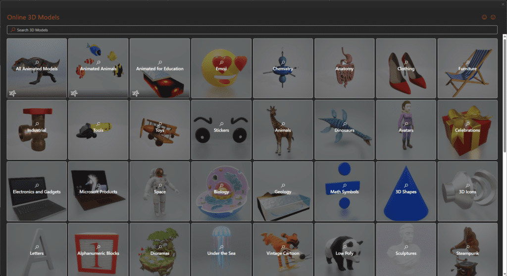
Incorporating 3D elements and animations can help you demonstrate complex concepts and ideas, make transitions smoother and more interesting, and keep your audience engaged from start to finish.
7- Mobile-Optimized Presentations
As mobile devices continue to dominate the digital landscape, it’s crucial to ensure your PowerPoint presentations are optimized for smaller screens. Mobile presentation design should consist of slides that are accessible and easy to read on all standard mobile sizes, ensuring a seamless viewing experience for your audience on the go.
Techniques such as keeping fonts and images large and easy to read, using contrasting colors, and minimizing large blocks of text can enhance mobile optimization and make sure your message comes across clearly on any device. Additionally, consider using a mobile-friendly template or designing your slides in a vertical format to better accommodate smartphones and tablets.
8- Creative Typography and Font Pairings
Typography is a crucial element of visual communication that can greatly impact the effectiveness of your presentation. By being creative with different font styles and combinations, you can enhance your message and elevate the overall design of your slides. You can try finding some cool font pairs here with the help of AI.
When choosing fonts, consider the purpose of your presentation and the audience you are targeting. A professional presentation aimed at a corporate audience may require a clean and simple font such as Arial or Helvetica, while a creative pitch to a young and artsy crowd may benefit from a more artistic font like Brush Script or Amatic SC. Make sure you follow the typography guidelines mentioned in the brand book of your company.
Long passages of text, like body text, are thought to be easier to read with serif fonts. This is especially true in print designs, where the serif element can help the reader’s eye follow each line. However, sans serif fonts are also quite readable and work well at lower sizes (for example, for captions or metadata).
Remember to keep it simple and avoid using too many fonts or styles that clash. Your goal is to create a cohesive and visually pleasing design that effectively conveys your message.
Conclusion
As presentation design continues to evolve, incorporating the latest design trends can help you stand out and captivate your audience. From the rise of minimalist design to the increased use of multimedia and vibrant color schemes, there are endless possibilities to create engaging presentations. Don’t be afraid to experiment with customized illustrations and typography or explore the world of 3D animated models to add a memorable touch to your work. And with the growing importance of mobile devices, optimizing your presentations for smaller screens should be a top priority.
By staying up-to-date with the latest PowerPoint design trends, you can elevate your work to new heights and leave a lasting impact on your audience. So go ahead with SlideGem! and try out some of these trends in your next presentation – your audience will thank you for it!