
Data has immense importance when it comes to presentations. Even though Content is King, Data is the soul of a presentation, and in order to produce a presentation of the highest quality, both content and data go hand in hand.
From a layman’s perspective, it might seem that data is nothing but numbers and statistics which instantly strikes a chord of boredom in the mind of the audience, but our job as presenters is to make sure this data is digestible and engaging, self-explanatory, and visually appealing.
Incorporating data the right way can be a real game-changer for your presentations. It makes your presentations look more authoritative, well-versed, and professional.
So, what exactly are the right ways to present data in the most appealing ways?
To answer this question, you first have to explore your options. Here are those options:
Venn diagram:
Venn diagrams are used to show data having common ground or distinction between the entities. This data is encapsulated in circles with each circle being a separate dominion. When there is a similarity between two circular entities, it is shown by the overlapping portion between the two circles.

Venn diagrams have come a long way and are considered one of the best methods to represent data having overlapping characteristics, that can be easily conceived while not losing their visual appeal.
Bar charts:
Bar charts are probably the most used data representation tools. Their significance comes from the fact that these charts are used in almost all niches of presentations out there. The simplicity, elegance, and professionalism they exude are unmatched.

These charts are an excellent option if the data being represented is consistent in the unit of quantities.
Line graph:
Line graphs have been in use for a long time now and are a great way to represent data showing trends over a given period of time. Due to the simple nature of these graphs, they can be easily conceived by the audience and hence can turn out to be highly effective while delivering presentations.
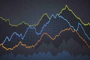
These graphs also give you an open hand while exploring different color options and customizing your data to be consistent with the overall presentation.
Pie chart:
Data having relative proportions and percentages out of a whole can be effectively represented by using Pie charts. They are quite popular and fairly easy to comprehend.

As a rule of thumb, it is always a good practice to have your pie chart divided into not more than six segments. In this way, the data shown is not too overwhelming and can be easily grasped by the audience without confusion.
Road maps:
Data having sequential flow and interlinked nature can be best described using road maps. They are renowned for showing the orderly flow of data to the audience leading to the ultimate result at last.

The use of this data representation tool is quite prominent in academic presentations as they are easy to understand, aesthetically pleasing, and simple.
Pictograms:
Pictograms are nothing but pictures, icons, and shapes used to represent data in the most visually appealing way. Their purpose is simple: To draw the audience’s attention and make the data more conceivable.
No one can deny the importance visual data has in place of numerical data. Just by changing the approach, the same information can be made much more understandable. This is probably why pictograms are great for presentations.
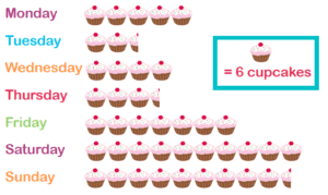
For instance, using the dollar sign or stacks of cash for data related to finances, using heart shapes for data related to dating and relationships, using globes for data related to travel statistics, etc.
Indicator:
If you want a dynamic and impactful data representation tool, then indicators are what you need. They are very striking and classy as they show the audience the current standing of a particular figure in our data and our desired goal for that figure to reach.

This is probably why indicators are an excellent choice for business presentations as they can be used to productively explain our desirable targets.
Bubble chart:
Bubble charts are a very fun way to represent data in the form of varying size bubbles. They are excellent at focusing the attention of the audience on the more crucial data in the presentation by encapsulating it in larger bubbles while the supporting data is inserted in smaller bubbles.
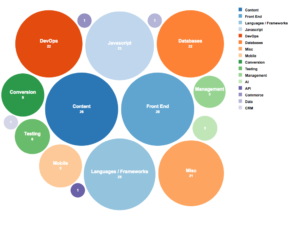
Whenever your data is widespread and has numerous distinct parameters, bubble charts are your go-to option. The great number of bubbles with varying sizes show that the data is split between many small values having different importance, and the instant analysis one can make from this situation can be very useful in delivering our message.
Tabular form:
The tabular form is undoubtedly one of the most ancient data visualization tools ever used, partly because of its simplicity and partly because it’s very easy to design. Nowadays, most presentations if not all use the tabular form to represent data.
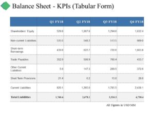
The way it works is fairly simple: All you need is to divide your data into two units and then construct a table having one unit on the vertical side and one on the horizontal.
Area maps:
Whenever there is geographical data that needs graphical representation, Area maps are of paramount importance in presenting this data. These maps are complemented by using shaded areas, colored zones, or blocks and shapes to highlight areas of importance on the map.

They are considerably used in Fields where geographical data is required. Without these maps, understanding geographical data would have been extremely difficult.
Conclusion:
Whenever you’re representing data just remember to be creative about it and put yourself in the audience’s shoes. Don’t stay focused on any one of these methods, instead, start mixing up these different data representation tools and come up with your own unique unorthodox idea.
Remember, there is no end to the limitless possibilities when it comes to representing data so start experimenting with what works for you and make your presentations shine.