
There is a common notion that awesome presentations can only be created using excellent and well-researched content. It might be right to some extent but there is something that is equally as important:
The Outlook!
Where excellent content is good for the body of the presentation, an aesthetic outlook is good for its soul. And whenever we speak of outlook, the thing which comes to our mind is the Color Theme.
Color sets a tone and helps the audience to establish a relationship with the content. It also helps the people to get some insight about the journey that you are going to take them on.
Your color schemes should always incorporate the following two vital elements:
Industry Association:
Every company has its color theme that must be kept in mind while designing its presentations. Your color palette should always depict the essence of your company.
It would be strange to use a bright and colorful scheme for delivering a presentation on serious matters. But the same will be perfectly fine for a primary school lecture.
Audience Interaction:
Your audience is always the game-changer. They can turn the tables against you even if you are delivering passionately. Therefore, you should always have a sound knowledge about the color schemes that you are using and whether they will resonate with the people sitting in front of you or not.
To get the exact know-how of colors, you do not need any extraordinary aesthetic sense. Just go through this article where we have spilled all the beans.
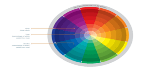
Inquisitively enough, Isaac Newton’s revelation can assist you with your presentations. Sir Isaac Newton’s color wheel is an indispensable piece of work for any student, manager, or team lead.
The wheel utilizes three essential tones, red, yellow, and blue, separated equitably. Mixing those tones makes the full shading wheel.
Now you can explore the below-mentioned color palettes that can be used as an ideal color combination.
Monochromatic:
It looks quite fancy if you are combining the different variations of the same color. This process might seem challenging, as one might think that this requires some aesthetic sense but in practice, it is easier.
You can do this by adding little portions of white, black, or grey. This will help you to create a nice and eye-pleasing contrast. However, there is still a precaution that needs to be taken care of. These color contrasts when shown on the projector are sometimes hard to recognize so therefore a balance should be maintained.
Analogous:
For crafting your presentations into smooth and harmonious color combinations, you will have to work upon the colors that are lying side by side to each other in the color wheel.
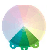
Now the last important thing is the feeling that these colors exhibit. It can be warm or cool which depends on the place where these colors exactly lie.
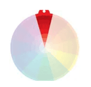
Complementary:
This is a great approach if you wish that your colors should give an essence of powerful contrasting and a compelling look.

For this to happen you need to select the colors from the opposite sides of Isaac’s color wheel. Another reason for using such color combinations is that it affects some people’s ability to perceive the information uniquely. Because everyone who can see, sees things in different ways.
Split Complementary:
This color variation is nothing but a slight modification of the complimentary variation. It involves a variation of the complementary color scheme.

The important thing here is that you do not choose the colors that are opposite to each other but the two tones that lie on both sides of it.
Triadic:
To form a lucid look, you should select three colors equally spaced around Newton’s color wheel of your choice that suit your presentation topic.

You can either select those colors with their original essence or you can select a shade of it depending upon the type of variations you want.
Tetradic:
To take your presentation game to the next level, you can use this color palette which involves two pairs of complementary colors.

For making this combination look aesthetic, select one color with strong essence as primary and use another with different variations to complement it.
Conclusion:
So there we have our best color scheme selection models that you capitalize on. Use them and rock those next presentations.